New strategies emerging for educator websites
“Get everything important above the fold.”
“Users don’t like scrolling.”
“Content is the only thing that matters.”
Sound familiar? They’ve been common mantra among web designers and strategists for years, but little by little, they’re becoming challenged by new ideas of what matters to web users - and to university students and prospects.
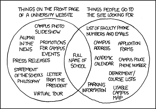
The questions about what students consider a good web experience really got going in 2010 with a cartoon by Randall Munroe’s web comic “xkcd.” It shows a Venn diagram exposing the difference between what a typical university would put on their home page ("Things on the front page of a university website") and what student visitors would like to see there ("Things people go to the site looking for"). The only thing common to both circles was the actual name of the school.
Responsive design
Increasingly, part of the “tool” conceptualisation has included “responsive design,” what UX Magazine defines as the “practice of creating digital experiences that adapt to seamlessly deliver content suited to the device context of the user’s operating system, screen size, or orientation.” This is especially critical when considering mobile. We all know how hooked students are to their cell/smart phones and tablets, and our observations are borne out in data:
“According to International Data Corporation [the IT market intelligence provider], mobile web browsing will soon eclipse desktop browsing in the US and worldwide. This consumption of mobile content isn’t just happening on the go; 93% of people are now using their mobile devices to browse the Web from their homes, according to a study from Google.”
The UX Magazine article has five helpful tips for working on responsive design, including this very important one: “Focus on key content - use metrics to help understand how content is being consumed, by whom, and why, as well as what content is missing.”
Just scroll with it
Speaking of how content is being consumed, there’s also a change in thinking on how much web users are willing to scroll. The old thinking was “get it all above the fold”: get all your branding and visuals - as well as key information - as high up as possible on users’ screens to avoid them having to scroll (thus, possibly missing key information). But now, this idea has been displaced by a conviction that people do and will scroll - we’re used to it by now, since we no longer “read” web pages the way we “read” newspapers. An article from Sharkbite explains what’s still crucial:
“The user should be able to understand what your site is about by the information presented to them above the fold. Positioning clear communication, branding, action statements and menu options in this area is a no-brainer. If someone can't figure out what you do from the moment they land on your site, then you need to rethink your web strategy.”
But Sharkbite goes on to say that beyond this branding and orientation mission, it’s okay to allow "roll out”: that is, to expect that users will take it upon themselves to explore the rest of the site.
Final thoughts
So once you’ve delivered the information students want, used responsive design, and abandoned “above the fold” thinking, you’re all set, right? Of course not. Then it's time for the gravy: the ways in which you can make your site a warm and inviting place for students to find out the latest news and events, interact with each other and faculty, and want to come back often. Nothing to it! Well, maybe a little to it. In a subsequent article, ICEF Monitor will take a closer look at case studies of universities that are doing a good job of inspiring the web community. Update: The follow-up article "Inspiring educator website case studies" can be found here. Sources: Inside Higher Ed, dylanwilbanks.com, Sharkbite